
Capture One, Digital Transitions, Gear Testing, Guest Writer, Phase One, Photographer Profile, Uncategorized
Photographer Jeffrey Totaro on his move to the Trichromatic
We are excited to have our longtime client Jeffrey Totaro share his experiences which lead to his recent upgrade from the Phase One IQ260 to the Phase One IQ3-100 Trichromatic.
I recently upgraded to the Phase One IQ3 100 Trichromatic digital back, and I thought I would share some comparisons between it and the Phase One IQ260 digital back.
All images were made on a technical camera with Canon TS-E lenses, except as noted. The images are straight out of Capture One 11 (including the annotations) with only minor tweaks were made to exposures and highlight control. In order to make the color balance as close as possible, I either shot a grey card in each or picked a very neutral color like a white wall to balance off of and picked a point as repeatable as possible so I could use the same point in each photo. These backs use different sensors and technology, and it’s hard to get them to look close in balance. This comparison is meant to be a bit of real world testing. I am not getting into the technology or any “by the numbers” evaluations here, just side by side comparisons from real situations, from the point of view of a working photographer.
I have been shooting with Phase One backs since 2005. I started with a Phase One P25 which I had for a few years and then upgraded to the Phase One P45+. I skipped the IQ1 series and then upgraded to a Phase One IQ260 in 2013. I am always curious to see what’s new with a new generation of Phase One backs; however, I was not that interested in the IQ3 100 when it came out. I didn’t really want more pixels although the CMOS sensor with higher ISO and way better Live View did tempt me. I thought I would wait and see what they had coming out in 2018. When the IQ3 100 Trichromatic was released, and I read the extensive testing and report provided by Digital Transitions, it got my attention.
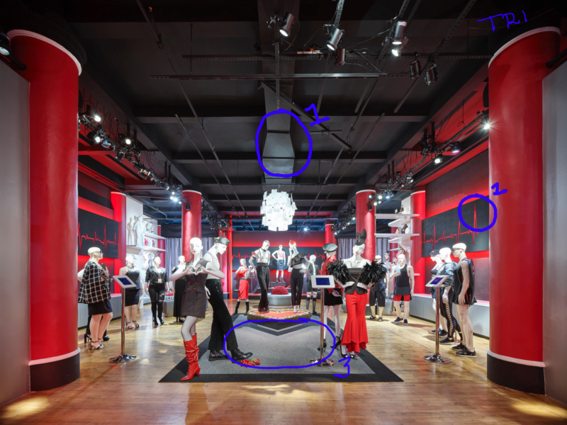
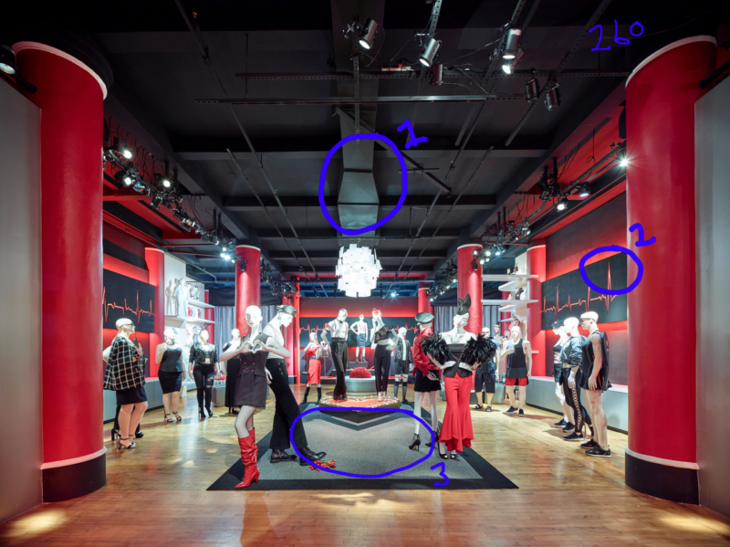
As an architectural photographer, color is certainly important since we are trying to replicate, as best we can, what the eye sees and what the architect or designer had in mind. I was certainly interested in the Trichromatic back if it could render more accurate colors especially in skies and mixed lighting situations. I asked Lance Schad of Digital Transitions if he had one to test out, and he sent me a unit to try. I didn’t think that the shoot I was doing that weekend would have much to really test the new back, but I was surprised at the results. This straight forward shoot didn’t have many technical challenges to deal with, but the Trichromatic’s color skills did make themselves apparent. (See Images 1 and 2 with annotations).
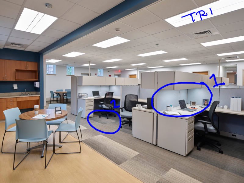
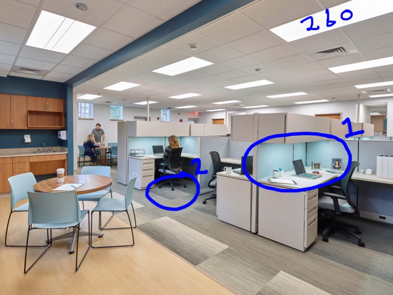
In this simple office interior, I was shocked at how well the Trichromatic handled the color shift coming from the under cabinet task lights on the desks visible in Area 1. Area 2 shows a similar benefit, but this time by neutralizing the reflected color that shows in the carpet. The 260 back suffers from the color shift contaminating the carpet color. In the shots from the 260, I was able to fix this issue with the Color Editor tool, but it was another required step and had to be processed separately since it also flattened the color in the blue chairs.
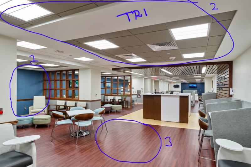
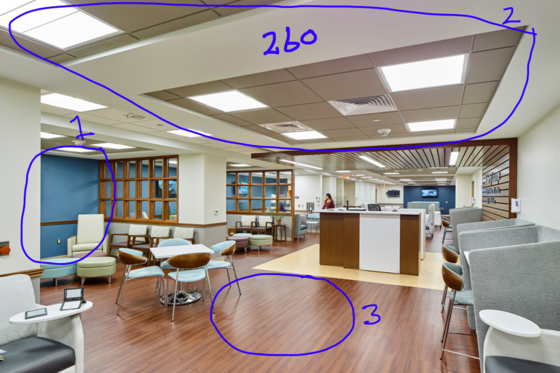
In the next example, Images 3 and 4 from the same shoot, there are more areas of interest. Overall the Trichromatic rendered the space more accurately. Area 1 shows a strong difference in the blue paint on the walls, again more accurate on the Trichromatic. Looking at the ceiling in Area 2, the Trichromatic presents a much more neutral ceiling color in these very neutral white and grey tones. The 260 looks more muddy and has more color shift across the neutral areas. While the designer preferred the floor color from the 260, the Trichromatic nailed the very red tone the floor really has in Area 3.
Images 5 and 6 are from a recent showroom shoot. While there are some differences in the reds between the photos, I am seeing once again a cleaner presentation from the Trichromatic when it comes to mixed light sources. Looking at the some of the black tones in Areas 1 and 2 from the 260, you can see some contamination from another light sources rendering the blacks too cyan in these areas. The Trichromatic cleans that up nicely. Also in the carpet, the Trichromatic has a more accurate neutral grey tone shown in Area 3.
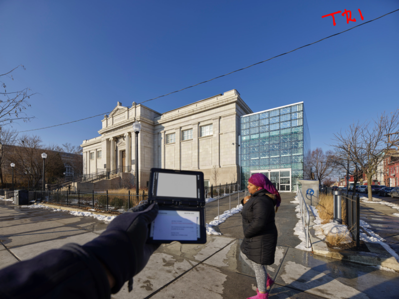
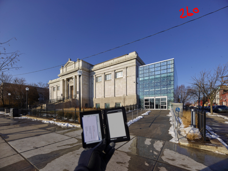
My last example is a simple blue sky. While I liked the 260 overall for the 4.5 years I used it, I always was frustrated by the blue skies which were always way to red/magenta. This is fixable in the Color Editor tool, but always left the sky to interpretation. These 2 photos really show the the much cleaner sky that the Trichromatic can deliver. I feel that sky no work at all vs. the 260 which shows distinct, if subtle, red contamination.
Making a move to a new camera always takes some testing and careful thought, but this move was very clear to me. The people at Digital Transitions made testing out the back very easy for me to do, and they were there with answers to questions I had. I feel very comfortable having upgraded to the Trichromatic back. Having the confidence that my camera system can render color very accurately is a great feeling. While the short comings of the 260 can be corrected in post, it’s very nice knowing there is actually less post work to be done on the Trichromatic images.